


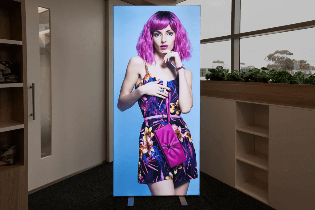
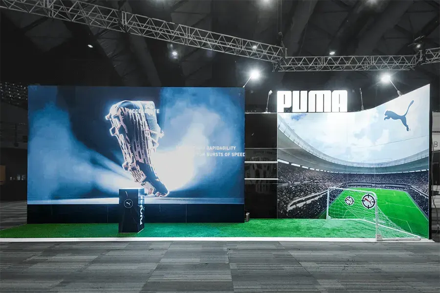
Your exhibition stand graphics should resemble the same elements and intentions as boutique storefronts. Your stand has 3-5 seconds to grab the attention of passing customers, the graphics must secure attention, clearly communicate your offerings and persuade visitors to explore your space.
Here are 10 things you should do to ensure your stand graphics leave a positive impression.
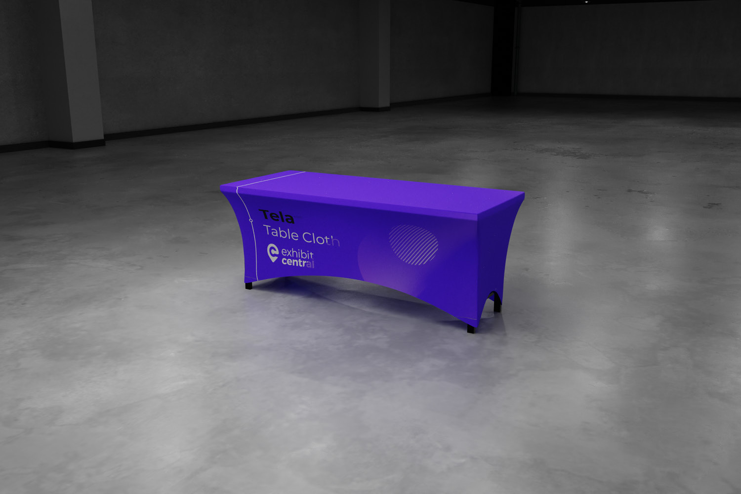
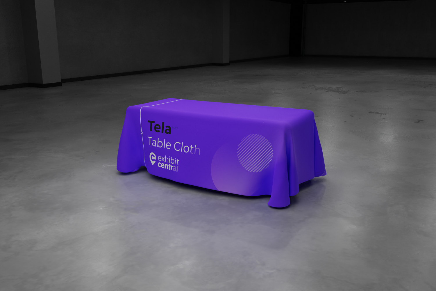
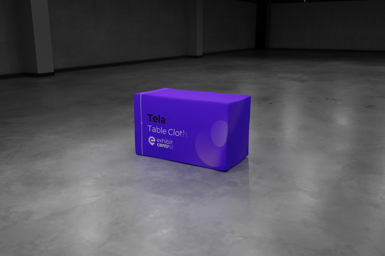
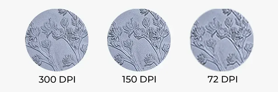
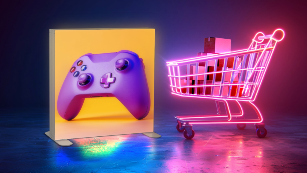
1. Good Image Quality
Ask an experienced designer the required resolution for the size parameters specific to your graphic space. As a general rule of thumb, back-wall images should be a minimum of 150 dpi, and closer to 300 dpi is preferred.
“Images usually perform double duty as both the main attraction element and the focal point of your graphics,” says Robert Duffany, graphic designer at Hill & Partners Inc. “But pixelated images, where the resolution is too low for the size of the panels, can ruin not only the graphics but also the impact of the entire exhibit.
“What’s more, pixelated images can make you look unprofessional,” says Martha Barnard, marketing manager at E4 Design. “Poor quality images can make attendees question whether your lack of attention to detail will carry through to your product or service.”
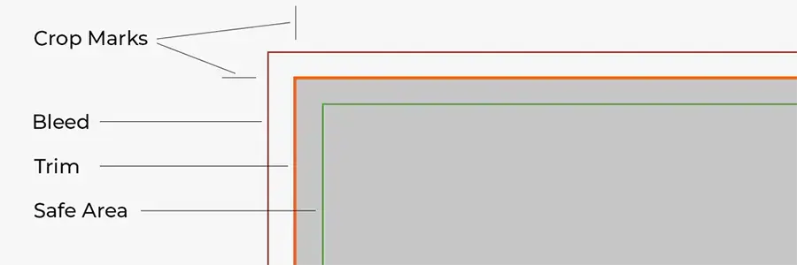
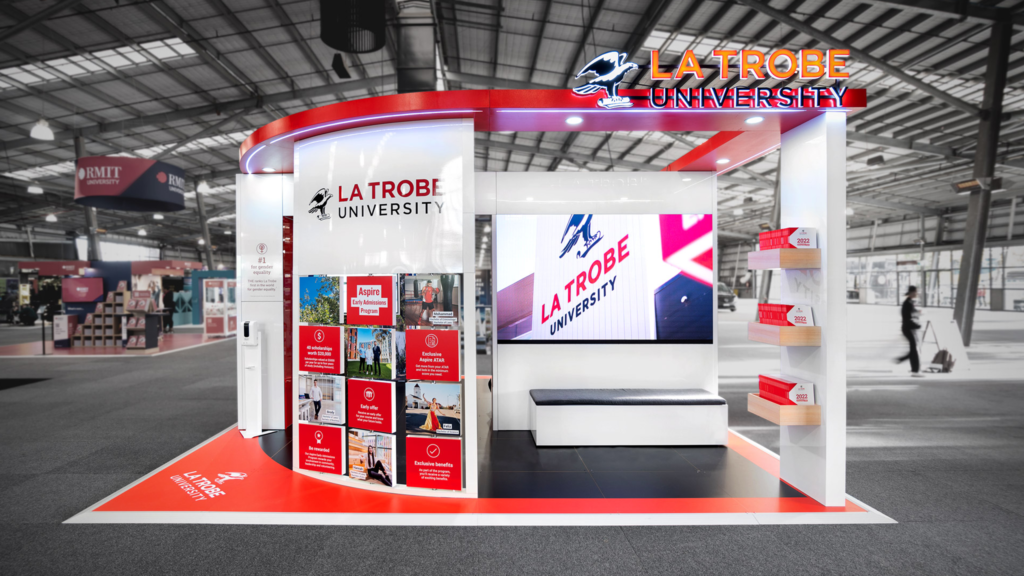
2. Coherent Image and Text Placement
The positioning of imagery and text on your stand is fundamental, not only to ensure optimal viewing position, but also to safeguard successful stand construction.
Critical branding, text and imagery should be positioned within the top one-third of a panel. Graphics and key messages placed on the bottom two-thirds will likely be blocked by stand staff and other exhibition displays such as counters, tablet stands and furniture.
Additionally, text and image placement is extremely important for silicon-edge graphics and tube fabric stands. These messages should be located a few centimeters in from the edge of the panel, so it doesn’t get lost or distorted along the edge of the fabric graphic where it wraps around the tube frame, or when the fabric’s silicon bead is inserted into the side of the frame.
Consult with your fabric graphic supplier to determine the ‘safe zone’ for graphic placement, to ensure optimal viewing of messaging once your graphic panel is set up.
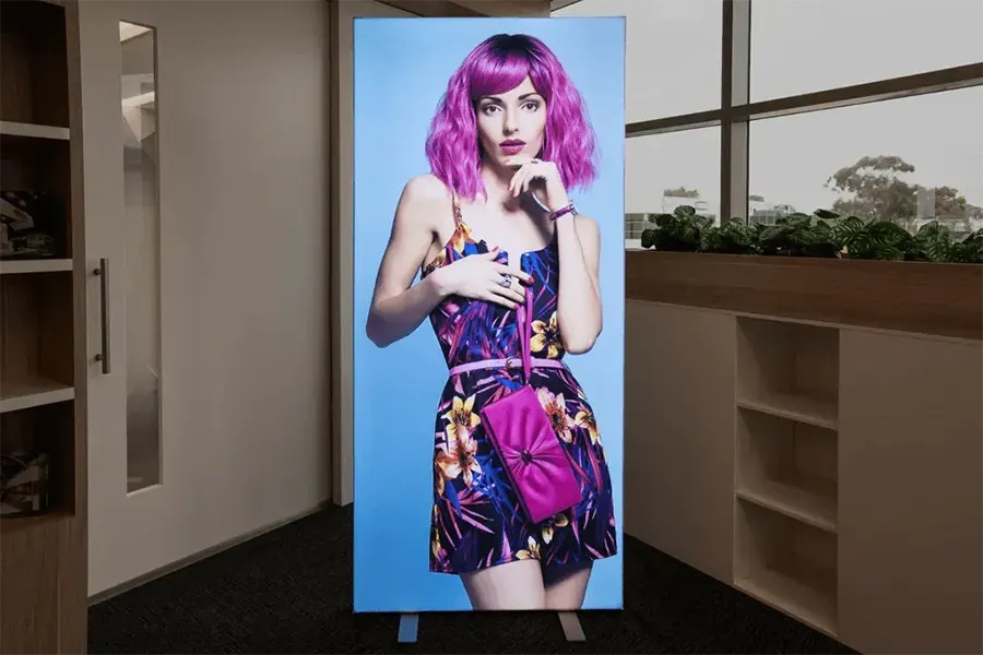
3. Superior Image Selection
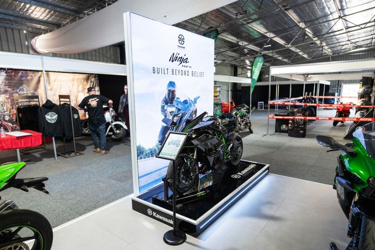
With the limited amount of time to raise and retain attendees’ attention, it is important to select one large, stunning image that fills the majority of your graphic display and grabs the eye. You don’t want their eyes bouncing from picture to picture on your graphic panel.
The image should draw an emotional response – perhaps through humour, empathy, or curiosity. Once they are engaged, attendee’s eyes will logically find your text.
Remember to consider readability when choosing the placement of your text on top and/or around imagery.
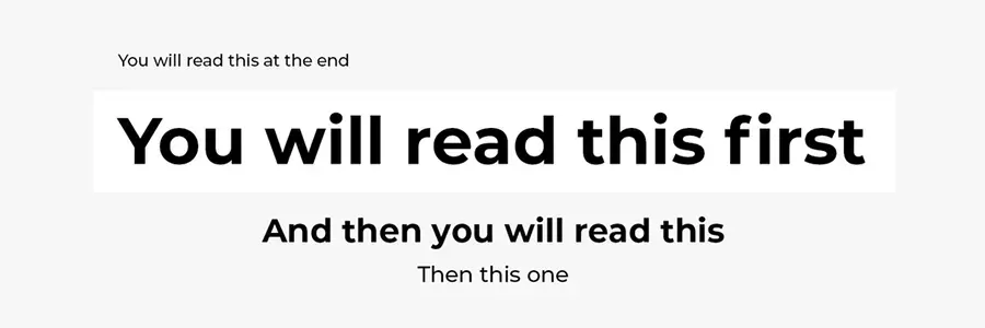
4. Clear Visual Hierarchy
Visual hierarchy enables visitors to swiftly scan information, and helps you communicate a message quickly and effectively. Attendees can pick up the key points and main message if the most important information is the most visually prominent.
There should always be a logical visual hierarchy when communicating messages on a graphic panel, and this should be based on the priorities of the information being presented. This directs attendees as to what they should explore first, second, third and so on.
Your most vital messaging, such as your company logo, key marketing phrases and product names should stand out in the design and always be the dominant element on your graphic panel – it should be the largest of your text and located in the most visible section.
5. Legible Text Size
You never want passing visitors to have to squint to read text on your backwall, words should always be large enough for attendees to easily read them from a distance. Text that can’t be read from the aisle will not convey your key messaging.
Visitors are at least 3.5 meters from your backwall show at most shows. As a general rule, text should be 2.5cm tall for every 1 metre, so all text on your graphic panels should be at least 8.75cm tall (keep in mind text size should also vary according to hierarchy, refer to point #4).
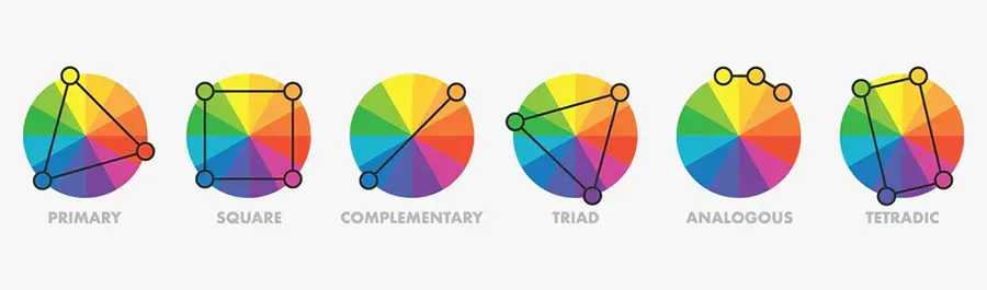
6. Effective Colour Combinations
Colour theory suggests you can convey your message more effectively, meet the needs of your target audience, build your brand and develop an edge over your competition, with correct colour selections.
Colours that clash with one another will reduce the effectiveness of otherwise well-designed graphics. The same principle applies to images and text – overlaying messaging on a busy background or on a similarly coloured surface will decrease the legibility of your message.
Furthermore, don’t mix too many colours in your exhibit. Consider adding varying shades of the same hue to maintain a cohesive look rather than completely different palettes.
Text colour must provide a sharp contrast with the background to ensure it remains readable, pair light-coloured text with a dark-coloured background and vice-versa.
Also, it is important to note colours may look different on various mediums and finishes – the same CMYK on a printed vinyl with gloss laminate will not visually match printed fabric graphics.
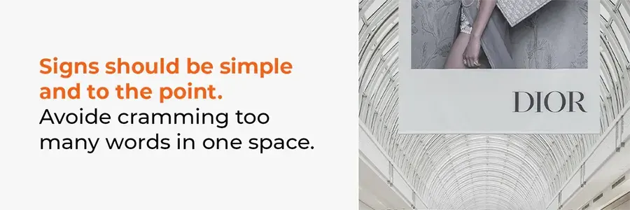
7. Thoughtful Word Selection
Brevity works. Be precise.
Many exhibitors make the mistake of putting too much content on their graphics. At exhibitions you need to communicate your key message or messages in as few words as possible.
Graphics messaging should focus on your target audiences’ needs by concisely conveying how your products can help them. Brief benefit statements that directly tells attendees what’s in it for them is a much more powerful engager than copy-heavy panels laden with product specifications.
8. Functional Fonts
Much like colour choice, there are also rules of thumb for font use. Text on graphic panels should be clear and easy to read. Avoid artsy fonts which are difficult to read and fight for the readers’ attention by competing with the image.
If attendees can’t read your message they will not comprehend it either. Clean serif and sans serif text styles are generally the easiest to distinguish and read. Also avoid using more than two different fonts on the same graphic panel.
9. Appropriate Text Density
Compelling messaging paired with complementary supporting visual elements create a cohesive and eye-catching display that will draw attendees onto your stand.
It’s important to remember that less is more – a single bold statement on a back-wall has more impact than one cluttered with text. Your message should be crisp, concise and catchy. Dry, lengthy sentences discourage attendees from reading your message. If you can’t shorten the text, utilise bullet points to break up longer lines of copy.
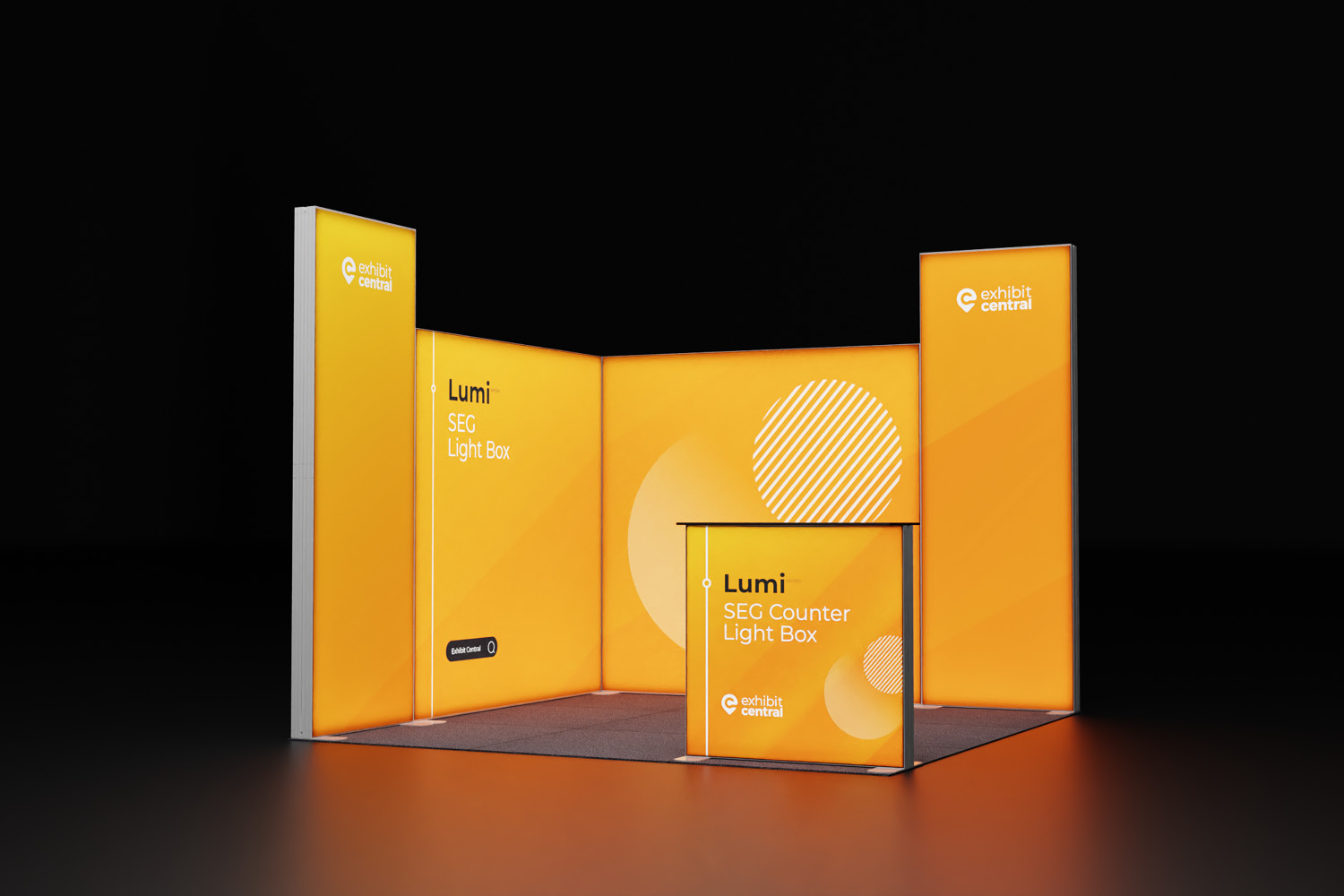
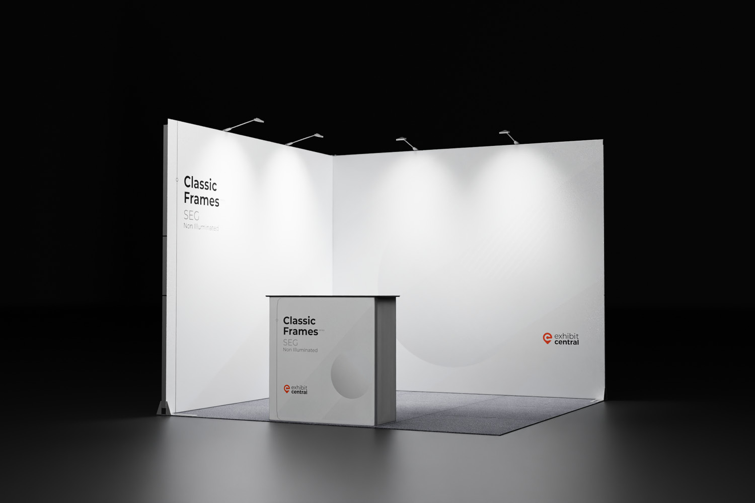
10. Optimal Lighting
Lighting on your stand is essential to ensure all the hard work put into bringing the stand to life don’t simply fade away. Incorporating lighting elements from simple arm lights to backlit logos not only increases visibility, but also emphasises elements such as key images or phrases.
For optimum coverage, position light fixtures 0.5m to 1m apart. You could also pick several areas on your graphic panels to throw light on, to serve as illuminated focal points.
Are you still looking for perfect exhibition products? Check our range to find the solution for your display needs.
Forging Connections from Your Shell Scheme Booth
Attending events, trade shows, and fairs is crucial for forging valuable connections. These gatherings provide opportunities to build relationships leading …
How Durable Shopping Centre Display Stands Support Sustainability
Today’s retail landscape has evolved significantly, going beyond the simple expectation that products should have value for money. Customers now …
How an Exhibition Pop Up Stand Display Can Help You Enter New Markets
Imagine attending a bustling trade show with potential customers you’ve never connected with. This is the reality when you target …
Boost Impulse Buys with Engaging Retail Promotional Signage
Impulse buying, those delightful unplanned purchases that surprise us, holds significant sway in the retail industry. Think about the last …